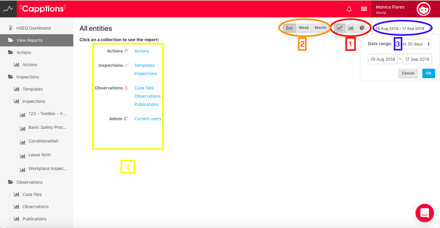
There's a few things you have to do before you can get a graph:
- Select a type of graph
- Select a period (top right corner)
- Select what type of data you want to report on
4. Use the grouping and filtering functions to tweak your graph and show the data that you think is important.
- Grouping means create different lines/bars for the selected entity. In the graph below I've grouped data based on current status of a template.
- Filtering means leaving out data (for instance only show inspections with label 'Not OK'
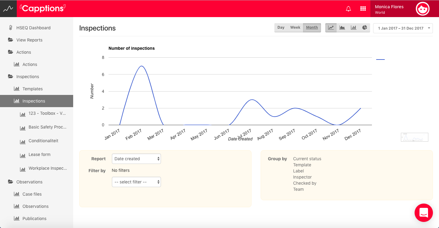
Once you're happy with your graph, you can copy it for usage in Powerpoint or Word. To do this right click on the tiny image next to the big graph and hit copy or save.
If you're interested in drilling down to the actual data, click on a point/bar in the big graph and you'll see the actual data right away!